
For a few days now, my trade portal WtE Monitor has looked different. It covers waste-to-energy, which is burning waste to produce power and heat, and until now it was a news blog. It is now a database with news attached: 179 plants in eight countries, 89 operator profiles, country profiles, a map and a comparison table.
What readers get out of it is described in the relaunch post over there. This is about the other side: how something like this gets built, and what goes wrong on the way. Quite a lot went wrong.
The actual problem
The data had been there for years. It was just inside articles. At some point I had written a piece about almost every plant, with capacity, year of commissioning and operator, phrased a little differently each time. Anyone who wanted to compare two plants opened two tabs and read.
So a large part of the relaunch was tidying up. Running text became fields: 37 per plant, from the number of incineration lines to the steam pressure. Only once a number sits in a field can you sort by it, put it on a map or place it behind a paywall.
One site – built in slices
The whole site was built in slices. A theme of its own and six small plugins, each with one job: data, search engines, newsletter sign-up, paywall, images and a question box. The data plugin alone has reached version 1.10.2. Every version is kept as a ZIP in an archive, so that I can go back when a new one breaks something.
The archive only helps against errors that break something, though. Most of the mishaps were the other kind: everything ran, and the result was still wrong. I found the first one on the map.
A power plant in the Atlantic
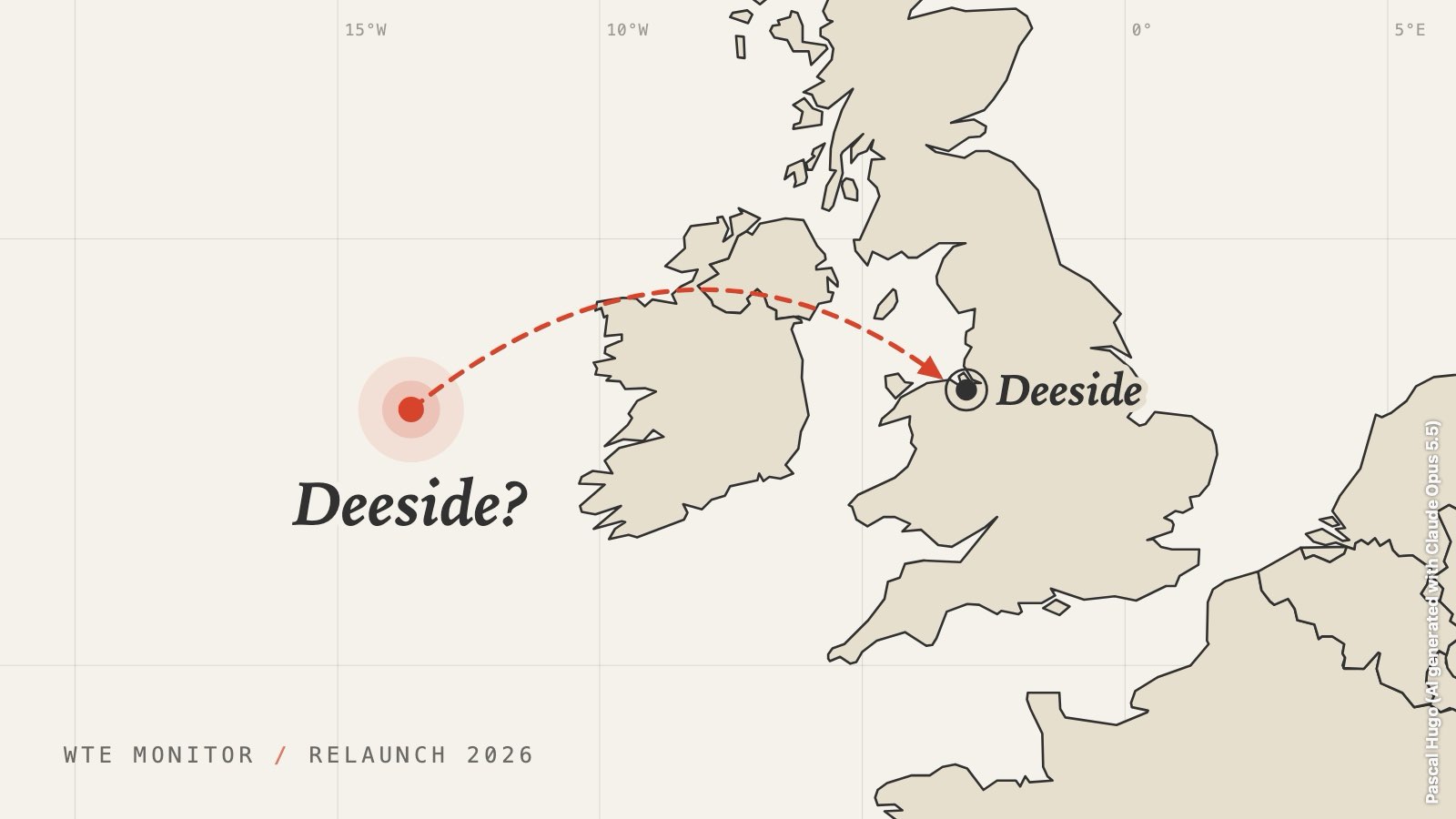
The Deeside plant, for instance, is actually in Wales. On my new map it sat in the sea, a fair way west of Ireland.
The Google Maps link was correct. I had copied it myself. The problem was in the small print. A link like that contains coordinates, but not those of the place. They are the coordinates of the centre of the picture. And because Google Maps opens an info panel on the left, the centre of the picture is never on the place you are looking at, but next to it. The further you have zoomed out, the further off it is. For Deeside, that was enough to reach the Atlantic.
The plugin now subtracts the offset, and for doubtful cases there is a list where I can type the coordinates in directly.
The newsletter becomes a plant
When the old articles moved into the new structure, a tool had to decide which pages were plants. It was generous. The page “Stay Updated on Waste-to-Energy News”, where people sign up for the newsletter, was declared a plant. No capacity and no operator, but a sign-up form.
I only noticed when the sign-up page was no longer where it belonged. Since then there has been a button that undoes a single move, and pages with a form are no longer suggested at all.
4.9 megabytes for one photo
I was sure Jetpack was shrinking my images. Then I measured. The header image of the Neumünster plant reached every visitor at full size: 4.9 MB for a photo that is barely bigger than a postcard on screen.
The cause was a single setting in my new templates. They asked for the image at its original size, and that is exactly what was delivered. The templates now request a fixed size. Another small plugin also shrinks every image to 200 KB at most as it is uploaded.
The Deeside plant is back on dry land, by the way. As far as I know, it never noticed.